


You already understand at a high level what A/B testing is and why marketers should care. Let’s get into what it takes to properly analyze A/B test results.
This post assumes you have access to machine learning modeling resources. If you don’t, feel free to sign up for Analyzr, our no-code modeling tool. We illustrate the A/B testing analysis steps below with Analyzr examples, but you can follow the same steps with any other modeling tool, such as a Jupyter notebook or another machine learning platform.
The five steps to analyze A/B testing results
Analyzing A/B testing results involves five steps. We will cover the process end to end. If you are interested primarily in technical topics, such as algorithm selection, go straight to Step 4.
- STEP 1: Create a dataset. Compile an aggregated dataset ready to use by your model.
- STEP 2: Create a model. Create an A/B testing model instance in your platform of choice.
- STEP 3: Explore your dataset. Explore and validate the dataset prior to using it in your model.
- STEP 4: Configure and train your model. Select relevant variables and choose an algorithm so you can start analyzing your A/B test results.
- STEP 5: Interpret A/B test results using your model. Apply your knowledge to deploy more effective campaigns and programs.
While some analysts will complete Step 3 (data exploration) before Step 2 (model creation), we go through this specific order here, as it is more efficient to do so when working from a single tool. In practice, you may find it helpful to go through a fair amount of data exploration on your own prior to using any modeling tool.
STEP 1: Create an A/B testing dataset
Take the time to assemble a dataset combining all the relevant attributes you know about each prospect or customer, e.g., in the case of customer retention analytics whether a customer has canceled service and all related demographic and usage data. By way of illustration, we will use the Telco Customer Churn dataset, a publicly available dataset. In practice you will spend a fair amount of time compiling your own dataset.
In the case of this customer churn dataset, we are interested in understanding how customers buying an additional service impacts retention, i.e., the likelihood they will stay with the company. To do so we will create new Boolean variables indicating for each customer whether the customer purchased a specific service. For instance we can create a variable named “UsersOnlineBackup” that is equal to 1 if the customer purchased online backup services, 0 otherwise. This process is known as feature engineering.
Best practices for compiling datasets will be the subject of a future post. You will need to use a combination of database platforms such as Snowflake, Amazon Redshift, Azure Synapse, or Google Big Query, and your business intelligence tool of choice such as Tableau, PowerBI, or Looker.
Once you’ve assembled your dataset, if you are using a Jupyter notebook, this is the part in your notebook where you would add a line of code to load your dataset. If you are using Analyzr, you will simply go the Datasets page and create a new dataset using the CSV file that contains your data. In our example, we are using the CVS file that we downloaded of the Telco Customer Churn dataset. Make sure you convert the churn outcome to a Boolean value (1 or 0) prior to uploading.
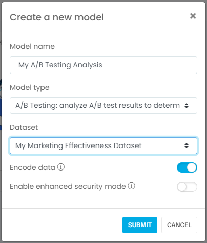
STEP 2: Create an A/B testing model
Next, you will create a model associated with your dataset. If you are using a Jupyter notebook, this is when you import the relevant machine learning libraries such as scikit-learn, CausalInference, or DoWhy. If you are using Analyzr, you simply go to the Models page and create a new model:
STEP 3: Explore your A/B testing dataset
It is important to validate that you have the right dataset, and establish some observations or hypotheses about the population you are trying to analyze. You should ask yourself the following questions:
- Is the sample size adequate? In most cases you will need at least a few thousand rows to produce meaningful results. In our example using the telco customer churn dataset, there are more than 7,000 records, so we should be fine.
- Did you include known major business drivers in the dataset? In our current example, we know from prior experience that number and type of services affect churn rates, and we included these in the dataset.
- Are you aware of meaningful changes over time that would affect the learning process? In other words, are you confident we can infer today’s behavior using yesterday’s data? In our example, the answer is “yes,” because we do not expect customer behavior to change.
- Last but not least, did you ingest the correct dataset properly? Does it look right in terms of number of rows, values appearing, etc.? It is fairly common for data to be corrupted if it is not handled using a production-grade process.
Congratulations! Now that you’ve answered these questions, you are ready to configure your A/B testing model.

STEP 4: Configure and train your A/B testing model
Variable selection
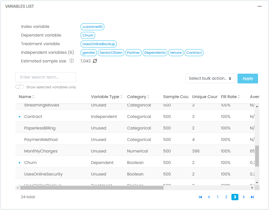
In this step, we will start by selecting variables and an algorithm. We will then train our model to interpret the results. You will need to identify and select two types of variables:
- A dependent variable: This is the outcome you are trying to analyze. It can be a simple yes/no or 1/0 variable, such as “did the prospect convert”. It can also be a numerical variable, such as how much a customer purchased. In our example using the telco churn dataset, the outcome we are modeling is whether a customer canceled service. Our dependent variable will be “Churn,” the variable in the dataset that captures this outcome and consists of ones and zeros.
- A treatment variable: This variable captures whether your prospects or customers were subjected to the program you are trying to assess, i.e. treated using the A/B testing terminology. It is equal to 1 if the individual was in the treated group, 0 if the individual was not and therefore belongs to the control group. In our case we are trying to assess the impact of buying online backup services, so our treatment variable is “UsesOnlineBackup”, the variable we created earlier. It is set to 1 if the customer purchased online backup services, 0 otherwise.
- Independent variables: These are all the other factors you want to take into account in the analysis. These should be variables that are likely to be different between your treated group and your control group and need to be accounted for to avoid biasing the analysis. In many cases this includes demographics, firmographics, or usage-based attributes. This step is key in ensuring our comparison between the two groups is apples-to-apples. In our case we want to make sure we account for the impact of the following variables:
- Tenure: how long a customer has been with the company
- Contract: whether the customer is under annual contract or not
- Gender: captures the customer’s gender
- Partner: whether the customer is married or not
- Dependents: whether the customer has children or not
- SeniorCitizen: whether the customer is retired or not
- An index variable: While this is technically not needed in theory, in practice it’s always an excellent idea to designate a record index that will positively and uniquely identify each record you are processing. It usually is the account ID or customer ID. This will allow you to audit your results and join them back to your original dataset.
Next, you will need to consider the following data manipulation issues. If you are using a Jupyter notebook, you would select the relevant columns of a data frame.
- What is the fill rate for the variables you selected? If you combine too many variables with low fill rates (i.e., a lot of missing values), the resulting dataset will have very few complete rows unless you fill in missing variables (see below).
- If you have missing values, what in-fill strategy should you consider? The most common strategies are (i) exclude empty values, (ii) replace empty values with zeros, (iii) replace empty values with the median of the dataset if the variable is numerical, or (iv) replace empty values with the “Unknown” label if the variable is categorical. Using option (ii) or option (iii) usually requires considering what the variable actually represents. For instance, if the variable represents the number of times a customer contacted support, it would be reasonable to assume an empty value means no contact took place and replace empty values with zeros. If the variable represents the length of time a customer has been with the company, using a median might be more appropriate. You will need to use your domain knowledge for this.
- Are you including variables with poor data quality that will introduce meaningful biases and artifacts in the clustering results? For instance if too many records are missing in a major variable and get included with a default value, this set of records will likely be identified as its own cluster even though this grouping has no relation to actual customer behavior; it is simply a reflection of data artifacts.
- Likewise, do you have outliers in your dataset? Do these outliers reflect reality or are they caused by data quality issues? If it is the latter you will need to remove outliers; if not they will bias your clustering results.
These data manipulations and validation steps are typically tedious with Jupyter notebooks but can be done straightforwardly with several tools, including Analyzr. In our example using the telco customer churn dataset, you will end up with 1 index variable, 1 dependent variable, 1 treatment variable, and 6 independent variables selected:
Algorithm selection
Once you’ve selected and pre-processed your variables, you will need to select an algorithm. The most common choices are:
- Propensity Score Matching. When in doubt use this general purpose algorithm. Its implementation using the CausalInference library tends to be fast and practical for most datasets. Average treatment effects are estimated using nearest-neighbor propensity score matching. Propensity estimation is done via a logistic regression. In cases where the CausalInference implementation fails, the DoWhy implementation is generally more robust but also significantly slower.
- Propensity Score Blocking. In cases where the dataset is imbalanced or not well randomized, traditional propensity score matching may not be accurate. The blocking approach, where blocks of records are grouped together for estimation rather than matching individual records, may yield better treatment estimates.
- Propensity Score Stratification. In cases where the dataset is imbalanced or not well randomized, traditional propensity score matching may not be accurate. The stratification approach, where records are grouped together in stratas for estimation rather than matching individual records, may yield better treatment estimates. This implementation by the DoWhy library is very similar to Propensity Score Blocking in the CausalInference library.
- Propensity Score Weighting. In cases where the dataset is small, traditional propensity score matching may drop too many records during the marching process. The weighting approach will keep all valid records by weighting them rather than dropping records, and may yield better treatment estimates when sample size is a concern.
- Ordinary Least Squares. The OLS method attempts to fit a linear model to the data to adjust for other variables when inferring treatment effects. It is one of the simplest methods and can be fast but also inaccurate if the problem being modeled is not inherently linear. For a better methodology, use the traditional Propensity Score Matching approach. If your dataset is imbalanced or not randomized you may want to consider Propensity Score Blocking or Propensity Score Stratification.
If you are curious how these different algorithms perform for various datasets, check out our performance benchmark analysis in this post.
In our example using the telco customer churn dataset, we will select Propensity Score Matching. Note that unless you have a specific reason to pick a different algorithm, you will generally do well using Propensity Score Matching; it is a general purpose algorithm that does well with most tabular data used by business analysts. In cases where your data is imbalanced or sparse, consider the other methods discussed above.
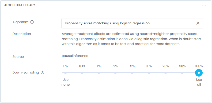
In practice it is a good idea to down-sample your dataset while you are still tweaking your model. In most cases, testing training on runs of a few thousand rows will be a faster and more efficient way to troubleshoot your model. Once you feel your model is configured properly, you can do a full training run on 100% of the training data. In our example using the telco customer churn dataset, the sample size is small enough that we don’t need to down-sample.
With your variables and algorithm selected, you are now ready to train your model. In a Jupyter notebook, you typically train by invoking the fit() function. In a no-code tool such as Analyzr, you simply go to the Train Model screen and click start. Once training is complete, you will to interpret your results!
STEP 5: Interpret results using your A/B testing model
Let’s start by taking a look at variance attribution. Remember we are trying to decide whether promoting online backup services is an effective strategy to increase overall customer retention. The hypothesis is that the more products we sell, the more likely we are to retain a customer. The marketing team decided to compare churn rates (the rate at which customers cancel service) between two groups: a group of customers who purchased online backup services, and one with customers who didn’t.
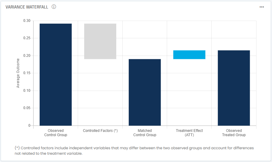
Appearances can be deceiving: the treated group (who purchased backup services) shows a churn rate of 21.5% annually or 2.0% monthly. The control group is at 29.2% annually or 2.8% monthly. So in appearance, the treatment is working and lowers churn, right? Well, the Propensity Score Matching output shows that a better matched control group would have annual churn of 19.0% or 1.7% monthly. This means the treatment is not working and actually increases churn.
How do we make sense of it? We need to consider and understand treatment effects:
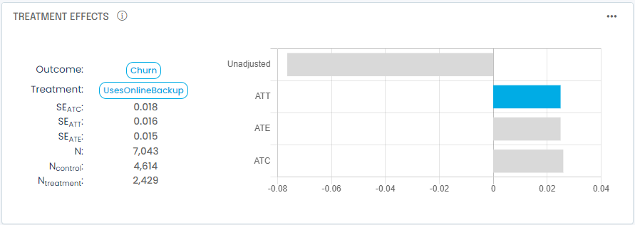
In addition to the unadjusted treatment impact, A/B testing analysis typically provides three estimates for treatment effects:
- Average Treatment Effect on the Treated (ATT). the ATT is the estimated average change in outcome for the treated group as a result of applying the treatment vs. if you had not. This is generally the most reliable estimate as the methodology adjusts as much as possible for all other factors to make this an apples-to-apples comparison between the treated group and the control group.
- Average Treatment Effect (ATE). this is the average change in your outcome variable (i.e. dependent variable) across the entire population if you applied the treatment to all in your dataset. It is often biased by a variety of factors you did not control or account for (confounding factors).
- Average Treatment Effect on the Control (ATC). the ATC is the estimated average change in outcome for the control group as a result of applying the treatment vs. if you had not.
You will generally care about the ATT since it measures what happened to your treated group. In cases where you believe you’ve accounted for all confounding factors with your independent variables, the ATE will be a good estimate of what would happen if you applied the treatment to the whole population, but beware of hidden confounding factors.
In our example we also notice the ATT is positive 0.025 vs. an unadjusted impact of -0.076. To make sense of it let’s look at what could bias our observed control group:
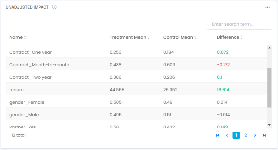
You see right away that the treated group over-indexes with longer-tenured customers with annual contracts. These attributes are known to be associated with lower churn, it is therefore normal to find out we have a treated group that will show naturally lower churn. Once you adjust for these differences you find out that, all else being equal, purchasing a backup service leads to more customers leaving, not fewer.
A last check worth making when interpreting propensity score matching results is to compare propensity distributions for the treated group and the matched control group:
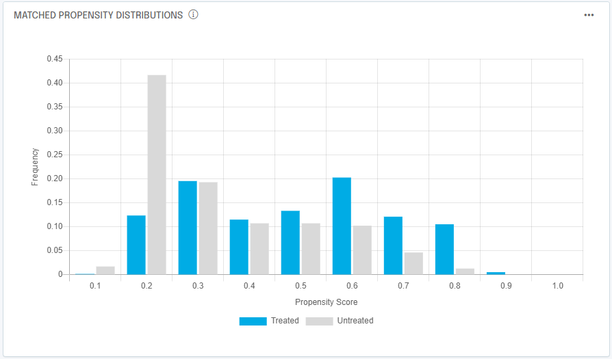
Remember the matched control group is assembled by looking at control prospects and/or customers that were as likely to experience the treatment, regardless of whether they experienced it or not. To get a good matched control group we should ensure there is reasonable overlap between the two groups across most propensity values. In our case, we have a good match of propensity distributions, which makes us confident in the results of the analysis.
If you’ve made it to this point, congratulations! Your analysis is complete.
How can we help?
Now you’re familiar with the basic steps involved in analyzing A/B testing results. Feel free to check us out at https://analyzr.ai or contact us below!
