


You already understand at a high level what a propensity model is and why marketers should care. Let’s get into what it takes to build a working propensity model.
This post assumes you have access to machine learning modeling resources. If you don’t, feel free to sign up for Analyzr, our no-code modeling tool. We illustrate the propensity modeling steps below with Analyzr examples, but you can follow the same steps with any other modeling tool, such as a Jupyter notebook or another machine learning platform.
The five steps to building a propensity model
Building a propensity model involves five steps. We will cover the process end to end. If you are interested primarily in technical topics, such as algorithm selection, go straight to Step 4.
- STEP 1: Create a dataset. Compile an aggregated dataset ready to use by your model.
- STEP 2: Create a model. Create a propensity model instance in your platform of choice.
- STEP 3: Explore your dataset. Explore and validate the dataset prior to using it in your model.
- STEP 4: Configure and train your model. Select relevant variables and choose an algorithm so you can start training your propensity model.
- STEP 5: Predict using your model. Apply your propensity model to a new dataset to make predictions.
While some analysts will complete Step 3 (data exploration) before Step 2 (model creation), we go through this specific order here, as it is more efficient to do so when working from a single tool. In practice, you may find it helpful to go through a fair amount of data exploration on your own prior to using any modeling tool.
STEP 1: Create a dataset
Take the time to assemble a dataset combining the outcome variable you are trying to model (e.g., whether a prospect will respond to a marketing campaign), with all the relevant attributes you know about each prospect. By way of illustration, we will use the Marketing Campaign dataset, a publicly available dataset. While this dataset is ready to use for modeling, in practice you will spend a fair amount of time compiling your own dataset.
Best practices for compiling datasets will be the subject of a future post. You will need to use a combination of database platforms such as Snowflake, Amazon Redshift, Azure Synapse, or Google Big Query, and your business intelligence tool of choice such as Tableau, PowerBI, or Looker.
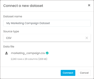
Once you’ve assembled your dataset, if you are using a Jupyter notebook, this is the part in your notebook where you would add a line of code to load your dataset. If you are using Analyzr, you will simply go the Datasets page and create a new dataset using the CSV file that contains your data. In our example, we are using the CVS file that we downloaded of the Marketing Campaign dataset.
STEP 2: Create a model
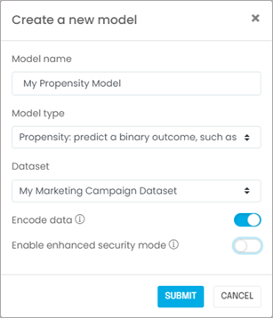
Next, you will create a model associated with your dataset. If you are using a Jupyter notebook, this is when you import the relevant machine learning libraries such as scikit-learn, Vaex, or Dask. If you are using Analyzr, you simply go to the Models page and create a new model:
STEP 3: Explore your dataset
It is important to validate that you have the right dataset, and establish some observations or hypotheses about the outcome you are trying to predict. You should also ask yourself the following questions:
- Is the sample size adequate? In most cases you will need at least a few thousand rows to produce meaningful results. In our example using the marketing campaign dataset, there are more than 2,000 records, so we should be fine.
- Did you include known major business drivers in the dataset? In our current example, we know from prior experience that marital status and education affect response rates, and we included these in the dataset.
- Are you aware of meaningful changes over time that would affect the learning process? In other words, are you confident we can infer today’s behavior using yesterday’s data? In our example, the answer is “yes,” because we do not expect customer behavior to change.
- Does the outcome you are predicting occur frequently or not? In our example, since only about 15% of prospects respond to marketing campaigns, we will consider using Synthetic Minority Oversampling Technique (SMOTE) pre-processing at a later stage. SMOTE is a technique that focuses training on positive outcomes when the dataset consists mostly of negative outcomes.
- Last but not least, did you ingest the correct dataset properly? Does it look right in terms of number of rows, values appearing, etc.? It is fairly common for data to be corrupted if it is not handled using a production-grade process.
Congratulations! Now that you’ve answered these questions, you are ready to configure your propensity model.

STEP 4: Configure and train your model
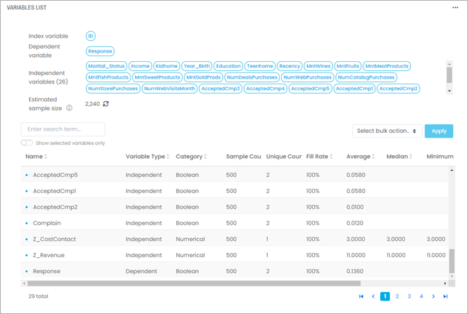
In this step, we will start by selecting variables and an algorithm. We will then train our model to interpret the results. You will need to identify and select three types of variables:
- A dependent variable: This is the outcome you are trying to predict. For most propensity models, it should be a simple yes/no or 1/0 variable. The outcome either happened or it did not, it’s either positive or negative. In our example using the marketing campaign dataset, the outcome we are modeling is whether a prospect responded to a campaign. Our dependent variable will be “Response,” the variable in the dataset that captures this outcome and consists of ones and zeros.
- Independent variables: These are your model inputs, sometimes called drivers or attributes, which will determine the outcome. These can be of any type (i.e., numerical, categorical, Boolean). You don’t have to know beforehand which variable is a relevant input, that’s what the training stage will determine. You only need to pick any variable that you think might be relevant and needs to be included.
- An index variable: While this is technically not needed in theory, in practice it’s always an excellent idea to designate a record index that will positively and uniquely identify each record you are processing. It usually is the account ID or customer ID. This will allow you to audit your results and join them back to your original dataset.
Next, you will need to consider the following data manipulation issues. If you are using a Jupyter notebook, you would select the relevant columns of a data frame.
- What is the fill rate for the variables you selected? If you combine too many variables with low fill rates (i.e., a lot of missing values), the resulting dataset will have very few complete rows unless you fill in missing variables (see below).
- If you have missing values, what in-fill strategy should you consider? The most common strategies are (i) exclude empty values, (ii) replace empty values with zeros, (iii) replace empty values with the median of the dataset if the variable is numerical, or (iv) replace empty values with the “Unknown” label if the variable is categorical. Using option (ii) or option (iii) usually requires considering what the variable actually represents. For instance, if the variable represents the number of times a customer contacted support, it would be reasonable to assume an empty value means no contact took place and replace empty values with zeros. If the variable represents the length of time a customer has been with the company, using a median might be more appropriate. You will need to use your domain knowledge for this.
- Make sure you split your data into a training set and a testing set. You will train your model on the training set and validate results using the testing set. There are several cross-validation techniques to do so efficiently; these are beyond the scope of this guide. Modeling tools such as Analyzr will handle training and validation seamlessly and transparently.
These data manipulations are typically tedious with Jupyter notebooks but can be done straightforwardly with several tools, including Analyzr. In our example using the marketing campaign dataset, you will end up with 1 index variable, 1 dependent variable, and 26 independent variables selected:
Once you’ve selected and pre-processed your variables, you will need to select an algorithm. The most common choices are:
- Logistic regression. The Logistic Regression algorithm is a great place to start. It’s very efficient, and it’s an easy way to compute propensities quickly on any dataset. However, it tends to be less accurate with datasets that have a large number of variables, complex or non-linear relationships, or collinear variables. In those cases, try other algorithms such as Random Forest.
- Random Forest. Use the Random Forest algorithm if you’ve already tried the Logistic Regression. While it tends to be a bit slower, Random Forest is a robust algorithm that does a great job classifying a variety of tabular datasets.
- XGBoost. The XGBoost classifier algorithm performs similarly to Random Forest. In general, XGBoost will be less robust in terms of over-fitting data and/or handling messy data, but it will do better when the dataset is unbalanced (i.e., when the outcome you are trying to predict is infrequent).
- Gradient Boosting classifier. In most cases, the Gradient Boosting classifier will not perform as well as Random Forest. It is slower and more sensitive to over-fitting. However, it occasionally does better in cases where Random Forest may be biased or limited (e.g., with categorical variables with many levels).
- AdaBoost classifier. The AdaBoost (adaptive boosting) classifier is both slower and more sensitive to noise than Random Forest or XGBoost. However, it can occasionally perform better with high-quality datasets when over-fitting is a concern.
- Extra trees. The Extra Trees (extremely randomized trees) classifier is similar to Random Forest. It tends to be significantly faster but will not do as well as Random Forest with noisy datasets and a large number of variables.
In our example using the marketing campaign dataset, we will select a logistic regression classifier:
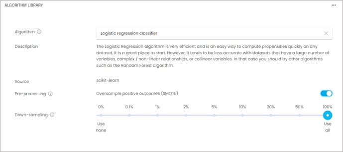
Since the outcome we are trying to predict in our example is infrequent (15% of cases), we will use SMOTE pre-processing, a technique used to improve the performance of propensity models with imbalanced datasets (i.e., in the event the outcome you are trying to prevent is infrequent).
Say you are trying to predict an event that occurs only in 3% of cases. The training dataset is likely going to have very few instances of the outcome you are trying to detect (e.g., 30 for every 1,000 records). This lack of data usually results in poor model performance, and it is common when the outcome to be predicted occurs in 15% of cases or fewer.
What SMOTE does is generate additional, so-called “synthetic,” data points that are randomly interpolated from the existing positive outcomes. This allows us to create a new training dataset with the same negative outcomes, and many more positive outcomes to the point where the training dataset is now balanced (i.e., there are as many positive outcomes as negative outcomes).
Once the propensity model is trained on the re-balanced dataset, its performance is then evaluated on a normal, imbalanced test dataset. Performance is usually markedly improved.
Another practical tip is to down-sample your dataset while you are still tweaking your model. In most cases, testing training on runs of a few thousand rows will be a faster and more efficient way to troubleshoot your model. Once you feel your model is configured properly, you can do a full training run on 100% of the training data. In our example using the marketing campaign dataset, the sample size is small enough that we don’t need to down-sample.
With your variables and algorithm selected, you are now ready to train your model. In a Jupyter notebook, you typically train by invoking the fit() function. In a no-code tool such as Analyzr, you simply go to the Train Model screen and click start. Once training is complete, you will produce a ranking of your variables called “feature importance chart,” or “driver rankings.” You will also get a set of error metrics:
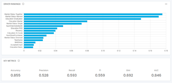
The driver rankings will tell you which independent variable is most important in determining whether an outcome is positive or negative. In our example, remember we are predicting responses to marketing campaigns. The driver rankings above show that, as expected, marital status and education are the most important predictors of whether a prospect will respond to our marketing campaign or not.
At the bottom of the example above, you also see error metrics that are typical of most propensity models:
- Accuracy: The accuracy score tells you how often the model was correct overall. It is defined as the number of correct predictions divided by the total number of predictions made. It is usually a meaningful number when the dataset is balanced (i.e., the number of positive outcomes is roughly equal to the number of negative outcomes). However, let’s take a dataset with only 10% of positive outcomes. A dumb model predicting the same zero outcome every time would have an accuracy of 95% (half the 10% positives are predicted correctly, all the negatives are predicted correctly). Clearly accuracy has its limitations.
- Precision: The precision score tells you how good your model is at predicting positive outcomes. It is defined as the number of correct positive predictions divided by the total number of positive predictions. It will help you understand how reliable your positive predictions are.
- Recall: The recall score tells you how often your model can detect a positive outcome. It is defined as the number of correct positive predictions divided by the total number of actual positive outcomes. It will help you understand how good you are at actually detecting positive outcomes, and it is especially helpful with unbalanced datasets, for example, datasets for which the positive outcome occurs rarely (think 10% of the time or less).
- F1 score: The F1 score is the harmonic mean of the precision and recall scores. Think of it as a composite of precision and recall. It is also a good overall metric to understand your model’s performance. Generally it will be a better indicator than accuracy.
- AUC: The Area Under Curve refers to the area under the Receiver Operating Characteristic (ROC) curve. It will be 1 for a perfect model and 0.5 for a random (terrible) model.
- Gini coefficient: The Gini coefficient is a scaled version of the AUC that ranges from -1 to +1. It is defined as 2 times the AUC minus 1.
Note that you may end up with slightly different results due to random sampling of the data when splitting your dataset into a training set and a validation set. If you’ve made it to this point, congratulations! Your model is now trained.

STEP 5: Predict using your model
You are now ready to predict campaign response outcomes for new prospects. To do so, you will typically invoke the predict() function in a Jupyter notebook or point and click in a no-code tool such as Analyzr. As you use your model over time, keep in mind the issue of model drift. See this post for an explanation of model drift.
How can we help?
Now you’re familiar with the basic steps involved in building a propensity model. Feel free to check us out at https://analyzr.ai or contact us below!
